Color matching is the art of combining colors harmoniously‚ essential in fashion‚ design‚ and art; It involves understanding color theory‚ the color wheel‚ and primary colors to create balanced palettes․ This guide provides practical tips and expert advice to help you master color coordination‚ ensuring your choices are visually appealing and cohesive․ Whether styling outfits or designing spaces‚ these principles will elevate your creativity and confidence in selecting perfect color combinations․
Understanding the Basics of Color Theory
Color theory is the foundation of effective color matching‚ explaining how colors interact and influence each other․ It begins with the color wheel‚ which organizes colors into primary (red‚ blue‚ yellow)‚ secondary (orange‚ green‚ purple)‚ and tertiary hues․ Warm colors‚ like red and orange‚ evoke energy‚ while cool colors‚ such as blue and green‚ create calmness․ Complementary colors‚ positioned opposite each other on the wheel‚ produce striking contrasts․ Understanding these principles helps in creating harmonious palettes and balanced designs․ By grasping color theory‚ you can make informed decisions to enhance your style and ensure cohesive color combinations in fashion‚ art‚ and design․
Why Color Matching is Important
Color matching is essential for creating visually appealing and cohesive designs in fashion‚ interior design‚ and art․ It ensures harmony and balance‚ making spaces and outfits look polished and professional․ Proper color coordination enhances the aesthetic appeal of products‚ clothing‚ and environments‚ influencing mood and perception; In fashion‚ it helps individuals express their style confidently‚ while in design‚ it transforms spaces into functional and beautiful areas․ Color matching also plays a role in branding‚ ensuring consistency and recognition․ By mastering color matching‚ you can elevate creativity‚ communicate effectively‚ and leave a lasting impression in both personal and professional projects․
The Color Wheel: A Fundamental Tool
The color wheel is a circular diagram displaying how colors relate․ It shows primary‚ secondary‚ and tertiary colors‚ helping to identify complementary and harmonious color combinations․
Primary‚ Secondary‚ and Tertiary Colors
Primary colors—red‚ blue‚ and yellow—are the foundation of the color wheel and cannot be created by mixing other colors․ Secondary colors‚ including orange‚ green‚ and violet‚ are formed by combining two primary colors․ Tertiary colors‚ such as blue-green or red-orange‚ are created by mixing a primary color with a secondary one․ These categories form the basis of color theory and are essential for understanding how colors interact․ The distinction between warm colors (like red and orange) and cool colors (like blue and green) further enhances the ability to create harmonious combinations․ By mastering these fundamentals‚ one can confidently explore advanced color matching techniques and design visually appealing palettes for various applications․
Warm vs․ Cool Colors: Understanding Temperature
Warm colors‚ such as red‚ orange‚ and yellow‚ evoke energy and vibrancy‚ often associated with sunlight and warmth․ Cool colors‚ like blue‚ green‚ and purple‚ create a calming effect‚ reminiscent of water and shade․ The distinction lies in their placement on the color wheel and their emotional impact․ Warm colors tend to advance visually‚ while cool colors recede‚ creating depth in designs․ Understanding this temperature difference is crucial for balancing compositions and evoking desired moods․ For example‚ pairing warm and cool colors can create dynamic contrast‚ while sticking to a single temperature ensures harmony․ This principle is vital in fashion‚ interior design‚ and art for achieving visually appealing results․
Complementary Colors: Finding Perfect Opposites
Complementary colors are pairs of colors directly opposite each other on the color wheel‚ such as blue and orange or red and green․ These combinations create high contrast and visual intensity‚ making each color appear brighter and more vibrant․ Complementary colors are ideal for drawing attention and adding energy to designs or outfits․ For example‚ pairing a cool blue with a warm orange creates a striking contrast․ To use them effectively‚ consider using one color as the dominant shade and the other as an accent․ This technique works well in fashion‚ art‚ and design to create dynamic and balanced compositions․ By leveraging complementary colors‚ you can achieve bold‚ eye-catching results that elevate your style or project․
Practical Tips for Successful Color Matching
Color matching enhances style and confidence․ Start with a neutral palette‚ use the 60-30-10 rule for balance‚ and consider color temperature to create harmonious combinations․
Start with a Neutral Color Palette
Beginning with a neutral color palette is a timeless strategy for mastering color matching․ Neutral tones like beige‚ white‚ and gray serve as a versatile foundation‚ allowing for effortless mixing and matching․ These colors are universal and provide a clean canvas for adding bolder or brighter hues․ By starting neutral‚ you can experiment with accents and secondary colors without risking clashing combinations․ Neutrals also enhance the quality‚ texture‚ and depth of other colors‚ making them ideal for both fashion and interior design․ This approach ensures a cohesive and polished look‚ whether styling an outfit or designing a space․ It’s a practical tip that simplifies the process of creating harmonious color schemes․
Using the 60-30-10 Rule for Balanced Combinations
The 60-30-10 rule is a practical guide for creating balanced color combinations․ Divide your palette into 60% dominant color‚ 30% secondary color‚ and 10% accent color․ This proportion ensures visual harmony and prevents overwhelming the senses․ The dominant color sets the tone‚ while the secondary color adds depth‚ and the accent color introduces contrast or interest․ This rule is particularly useful in fashion and interior design‚ helping to avoid clashing colors and create cohesive looks․ By applying this principle‚ you can achieve professional-level styling without complexity․ It’s a simple yet effective method to ensure your color choices are balanced and aesthetically pleasing‚ whether for outfits‚ rooms‚ or artistic projects․
Choosing a Dominant Color and Adding Accents
Selecting a dominant color is the first step in creating a harmonious palette․ This color will occupy the majority of your design or outfit‚ setting the overall tone and mood․ Once chosen‚ accents can be added to introduce contrast and interest; Use complementary or contrasting colors for accents to draw attention to specific details․ For example‚ pairing warm neutrals with bold cool tones creates dynamic visual appeal․ In fashion‚ this might mean a neutral outfit with a vibrant handbag or shoes․ In design‚ it could involve a statement wall or decorative elements․ This approach ensures balance while allowing personality to shine through․ Always test colors in different lighting conditions to ensure consistency and harmony in your final look․
Considering Color Temperature in Your Choices
Color temperature plays a crucial role in creating harmonious palettes․ Warm colors‚ such as oranges and reds‚ evoke energy and vibrancy‚ while cool colors like blues and greens offer calmness and serenity․ When selecting colors‚ consider the mood you want to convey․ Warm tones are ideal for creating a lively atmosphere‚ while cool tones suit serene and balanced compositions․ Neutral shades‚ like beige or gray‚ can act as a bridge between warm and cool colors‚ ensuring harmony․ Pairing warm colors with warm and cool with cool generally works well‚ as they naturally complement each other․ Experiment with these temperatures to achieve the desired aesthetic‚ whether in fashion‚ design‚ or art․ This balance ensures a cohesive and visually appealing result․
Practical Tips for Avoiding Common Mistakes
Avoiding common mistakes in color matching starts with understanding the basics of color theory and testing your choices․ Overusing bold colors can overwhelm a palette‚ so balance them with neutrals․ Don’t neglect lighting conditions‚ as colors can appear differently under natural vs․ artificial light․ Always test samples in multiple settings before committing․ Ignoring the 60-30-10 rule can lead to unbalanced combinations‚ so use it as a guideline․ Avoid clashing warm and cool tones without a neutral bridge․ Focus on quality and texture to ensure depth in your palette․ Finally‚ don’t rush—plan your color choices carefully to avoid mismatched hues․ These tips will help you create cohesive‚ visually appealing color schemes with confidence․
Real-Life Applications of Color Matching
Color matching enhances fashion outfits‚ interior spaces‚ and makeup looks‚ ensuring harmonious and stylish results․ It’s vital in design‚ art‚ and everyday aesthetics‚ making creativity more impactful and cohesive․
Color Matching in Fashion: Creating Stylish Outfits
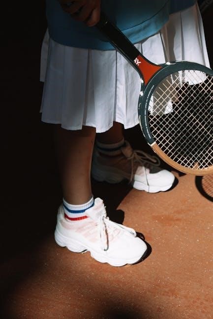
Color matching in fashion is key to crafting stylish‚ cohesive outfits․ By understanding warm and cool tones‚ you can pair colors that complement each other․ Start with a neutral base‚ like beige or navy‚ and add pops of color for contrast․ The 60-30-10 rule is a great guideline: 60% dominant color‚ 30% secondary‚ and 10% accent․ For example‚ pair warm yellow with earthy browns or cool blues with soft pinks․ Using the color wheel‚ identify complementary hues to create bold statements or analogous shades for subtle looks․ Experimenting with textures and depths adds dimension to your outfits․ Mastering these techniques ensures your wardrobe choices are harmonious‚ boosting your personal style and confidence․
Color Matching in Interior Design: Harmonious Spaces
Color matching in interior design creates harmonious and inviting spaces by balancing hues that complement each other․ Start with a neutral palette as a base‚ then incorporate warm or cool tones to set the mood․ The 60-30-10 rule is ideal: 60% dominant color for walls‚ 30% secondary for furniture‚ and 10% accent for decor․ Use the color wheel to find complementary or analogous shades that blend seamlessly․ Consider the natural lighting and texture of materials to enhance color depth․ For example‚ warm browns and beiges create coziness‚ while cool blues and greens evoke calmness․ Testing colors in different lighting ensures the perfect match‚ transforming your space into a stylish retreat that reflects your personal style and enhances functionality․
Color Matching in Makeup: Enhancing Your Look
Color matching in makeup enhances your natural beauty by selecting shades that complement your skin tone and personal style․ Start by matching your foundation to your skin tone‚ ensuring a seamless base․ Highlighters and bronzers should enhance your features without clashing‚ while eyeshadows and lip colors should harmonize with your overall look․ Warm and cool tones can be paired strategically to create balance․ For example‚ blue-based shades can reduce sallowness‚ while peach tones brighten the complexion․ Use the color wheel to find complementary hues for bold statements․ Testing colors in different lighting ensures accuracy․ Focus on quality‚ texture‚ and depth to elevate your makeup game‚ creating a polished and radiant appearance that boosts confidence and enhances your natural beauty․
Advanced Techniques for Color Matching
Exploring advanced color matching techniques involves mastering analogous‚ complementary‚ and triadic schemes․ These methods create dynamic‚ sophisticated palettes by balancing hues and contrasts‚ elevating your creative style․
Using Analogous Colors for Subtle Combinations
Analogous colors are hues adjacent on the color wheel‚ creating smooth‚ harmonious transitions․ This technique minimizes contrast‚ offering a subtle yet cohesive look․ For example‚ pairing blue‚ teal‚ and green produces a calming effect․ To enhance depth‚ choose one dominant color and use others for accents․ This method is ideal for designs requiring unity without bold contrasts․ It works well in fashion for creating outfits that appear polished and understated․ Analogous colors also simplify decision-making‚ as they naturally complement each other․ By focusing on this approach‚ you can craft sophisticated‚ visually pleasing combinations that exude elegance and balance․
Creating Contrast with Complementary Colors
Complementary colors are pairs located directly opposite each other on the color wheel‚ such as blue and orange or red and green․ These combinations create bold‚ vibrant contrasts that draw attention and add energy to designs․ To use them effectively‚ pair a dominant color with its complement as an accent to avoid overwhelming the senses․ For example‚ a yellow dress with purple accessories creates a striking yet balanced look․ This technique is ideal for making elements stand out while maintaining visual interest․ Complementary colors can evoke strong emotions‚ with warm colors like red stimulating excitement and cool colors like blue promoting calmness․ Experimenting with these pairs allows for dynamic‚ eye-catching results in fashion‚ art‚ and design․
Exploring Triadic Color Schemes
A triadic color scheme involves three colors that are equally spaced on the color wheel‚ forming a triangle․ This method creates vibrant‚ balanced combinations that are rich in contrast and energy․ For example‚ pairing blue‚ yellow‚ and red results in a dynamic and visually striking palette․ These schemes are ideal for adding excitement and complexity to designs or outfits․ To avoid overwhelming the senses‚ one color can be used as a dominant shade‚ while the others serve as accents․ Triadic color schemes are particularly effective in fashion‚ interior design‚ and art‚ offering a versatile way to explore bold creativity․ By experimenting with these harmonious yet contrasting combinations‚ you can create unique and eye-catching styles that elevate your projects․
Understanding Split-Complementary Color Schemes
A split-complementary color scheme is a sophisticated variation of the complementary color scheme․ It involves selecting a base color and pairing it with the two colors adjacent to its complementary color․ For instance‚ if blue is chosen as the base‚ its complementary color is orange; the split-complementary colors would then be yellow-orange and red-orange․ This creates a trio of colors that are related yet distinct‚ offering a balanced and harmonious palette․ The split-complementary approach enhances creativity by adding variety while maintaining visual interest․ It is widely used in fashion and interior design to craft outfits or spaces with a main color and complementary accents‚ ensuring a cohesive and appealing aesthetic․ This method provides a versatile framework for designing with contrast and harmony‚ making it a valuable tool for artists and designers seeking nuanced color combinations․
Tools and Resources for Color Matching
Explore online color matching apps‚ physical charts‚ and AI-powered solutions to streamline your color selection process․ These tools offer instant color combinations‚ swatches‚ and expert recommendations for perfect matches․
Online Color Matching Tools and Apps
Online color matching tools and apps are essential for streamlining your color selection process․ Platforms like Adobe Color and Canva offer intuitive interfaces to create and explore color palettes․ These tools allow you to pick complementary colors‚ generate harmonious combinations‚ and even upload images to extract color schemes․ Apps like Color Hunt provide inspiration with curated palettes‚ while AI-powered solutions analyze trends and suggest modern combinations․ Many tools also offer real-time collaboration‚ making them ideal for designers and artists․ Whether you’re styling outfits‚ designing websites‚ or painting‚ these resources help you find the perfect hues quickly and efficiently․ They are indispensable for achieving professional-grade color coordination with minimal effort․
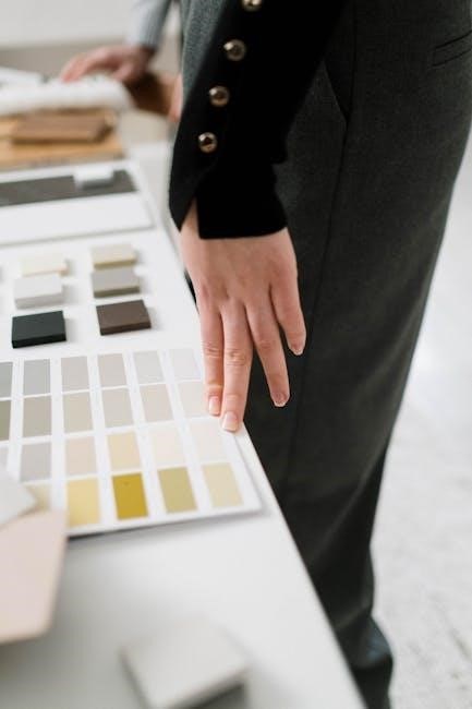
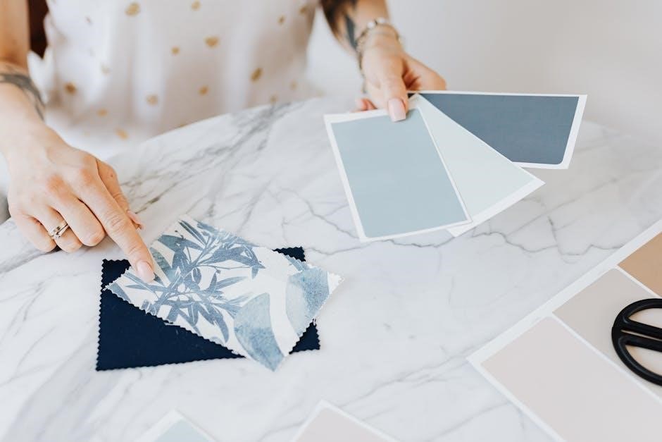
Physical Color Charts and Swatches
Physical color charts and swatches are indispensable tools for accurate color matching․ Tools like Pantone color charts provide standardized references for consistent color reproduction․ These charts display a wide range of hues‚ allowing users to identify precise shades and create cohesive palettes․ Swatches‚ often used in fashion and design‚ enable tactile comparison of colors under different lighting conditions․ They are particularly useful for ensuring color accuracy in projects involving fabrics‚ paints‚ or cosmetics․ By organizing colors systematically‚ these resources simplify the process of finding complementary or analogous shades․ Whether for professional design or personal creativity‚ physical color charts and swatches remain essential for achieving precise and visually appealing color combinations․
AI-Powered Color Matching Solutions
AI-powered color matching solutions are revolutionizing how we approach color coordination․ Advanced algorithms analyze vast color libraries to suggest harmonious palettes and optimal combinations․ Tools like Effective Colors and Magic Palette leverage AI to help artists and designers identify precise shades and create balanced looks․ These solutions excel in real-time color matching‚ enabling quick adjustments and enhancing accuracy․ AI also aids in complex tasks‚ such as matching colors across different materials or lighting conditions‚ ensuring consistency․ By streamlining the color selection process‚ AI empowers creativity while saving time․ These innovative tools are transforming industries‚ from fashion to interior design‚ making professional-grade color matching accessible to everyone․ They represent the future of color coordination‚ blending technology with artistic vision for unparalleled results․
Expert Tips and Tricks
Focus on quality‚ texture‚ and depth of color․ Consider fabric‚ lighting‚ and personal style to create timeless‚ cohesive looks․ Elevate your style with confidence․
Focus on Quality‚ Texture‚ and Depth of Color
Focusing on the quality‚ texture‚ and depth of color enhances the visual appeal of any design or outfit․ Quality refers to the richness and vibrancy of the color‚ while texture adds dimension‚ making the palette more engaging․ Depth is achieved by layering colors with varying intensities‚ creating a sophisticated look․ Consider the fabric‚ material‚ or medium when selecting colors‚ as these factors influence how colors appear․ Lighting conditions also play a role‚ so it’s essential to test colors in different environments․ By prioritizing these elements‚ you can create timeless‚ cohesive combinations that elevate your style and design․ This approach ensures your choices are not only visually appealing but also meaningful and polished․
Using the Color Wheel for Inspired Combinations
The color wheel is an indispensable tool for creating inspired color combinations․ It organizes colors in a circular format‚ showing how they relate to one another․ By understanding primary‚ secondary‚ and tertiary colors‚ you can identify complementary‚ analogous‚ and triadic schemes․ Complementary colors‚ found opposite each other‚ create bold contrasts‚ while analogous colors offer smooth transitions․ Triadic combinations‚ formed by three evenly spaced colors‚ add vibrancy and balance․ The color wheel also helps in distinguishing warm and cool tones‚ ensuring harmonious pairings․ Experimenting with these relationships can spark creativity and guide you in making confident‚ visually appealing choices for fashion‚ design‚ or art projects․ It’s a timeless resource for anyone aiming to master color matching․
Testing Colors in Different Lighting Conditions
Lighting plays a crucial role in how colors appear‚ making it essential to test color combinations under various conditions․ Natural light provides the most accurate color representation‚ while artificial lighting can alter hues due to its temperature and intensity․ For instance‚ warm lighting may enhance warm tones‚ while cool lighting can make colors appear bluer․ To ensure consistency‚ view colors in multiple settings‚ including daylight‚ LED‚ and incandescent lighting․ This practice is particularly vital in fashion and design‚ where color accuracy impacts the final outcome․ By testing colors in different lighting‚ you can make informed decisions and achieve the desired visual effect in any environment․ This step ensures your color choices remain consistent and visually appealing across diverse conditions․

Current Trends in Color Matching
Bold contrasts‚ minimalistic neutrals‚ and vibrant yellows dominate 2025 trends‚ blending sustainability with technology for innovative color solutions that captivate and inspire modern design and fashion․
Popular Color Combinations in 2025
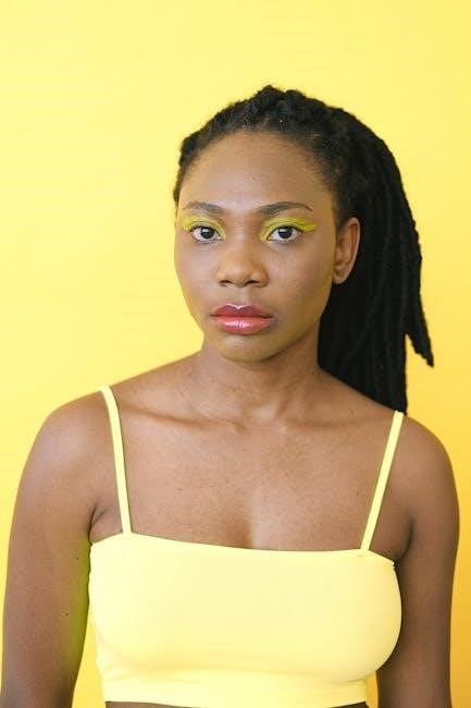
In 2025‚ color trends emphasize bold contrasts and minimalistic neutrals‚ with vibrant yellows‚ deep blues‚ and soft pastels dominating the scene․ One of the most popular combinations is mustard yellow paired with sage green and powder blue‚ creating a harmonious balance between warmth and coolness․ Neutral tones like beige and cream serve as a base‚ allowing brighter hues to stand out․ Bold contrasts‚ such as pairing emerald green with coral red‚ are also gaining traction‚ adding energy to outfits and designs․ Additionally‚ soft peach and lavender shades are being used to create soft‚ romantic palettes․ These combinations reflect a blend of sustainability and technological advancements‚ catering to modern aesthetics in fashion‚ interior design‚ and digital spaces․
Emerging Trends in Fashion and Design
In 2025‚ fashion and design are embracing vibrant‚ bold color combinations while maintaining a focus on sustainability․ Digital influences are driving trends‚ with metallic accents and neon hues making a comeback․ Minimalistic neutrals are being paired with bright‚ statement colors to create contrast․ Emerging trends include the use of monochromatic schemes with subtle variations in texture and tone․ Nature-inspired palettes‚ such as earthy greens and ocean blues‚ are gaining popularity for their calming effects; Additionally‚ the integration of AI in color matching is enabling personalized recommendations‚ allowing individuals to explore unique and harmonious combinations tailored to their preferences․ These trends reflect a blend of innovation‚ personalization‚ and environmental consciousness‚ shaping the future of style and design․
Mastering color matching enhances creativity and style‚ ensuring harmonious combinations in fashion‚ design‚ and art․ By applying these principles‚ you can confidently create visually appealing and cohesive looks‚ elevating your aesthetic․
Mastering Color Matching for Enhanced Style
Mastering color matching is a skill that elevates personal style and creativity․ By understanding color theory and the color wheel‚ individuals can create harmonious outfits and designs․ Start with neutral palettes and apply the 60-30-10 rule for balance․ Focus on quality‚ texture‚ and depth of colors rather than just matching․ Warm and cool tones should be paired thoughtfully‚ while complementary colors can add contrast․ Testing colors in different lighting ensures accuracy․ With practice‚ anyone can develop a keen eye for color‚ leading to confident‚ stylish choices․ This expertise transcends fashion‚ enhancing makeup‚ interior design‚ and art․ Perfect color coordination is achievable with patience and a solid understanding of the fundamentals․
Future of Color Matching: What to Expect
The future of color matching is poised for innovation‚ with AI-powered tools and advanced technologies leading the way․ Expect more intuitive color selection processes‚ real-time color matching apps‚ and virtual try-on features․ Sustainability will play a key role‚ with tools aiding in eco-friendly color palette creation․ Personalized color recommendations based on individual preferences and trends will become mainstream․ Virtual reality and augmented reality will enhance color visualization‚ making design and fashion decisions easier․ The integration of color theory with AI will democratize access to professional-grade color matching‚ allowing everyone to create harmonious and stylish combinations effortlessly․ These advancements promise to make color matching faster‚ more accurate‚ and universally accessible․